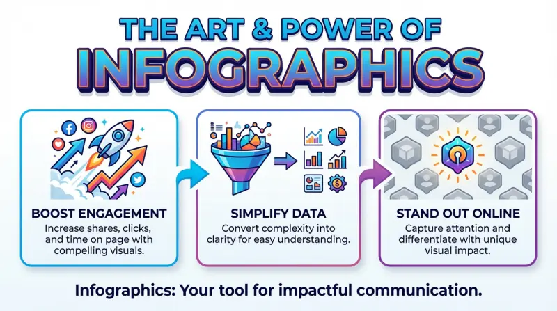
Are you struggling to make your data memorable or your message stick? The solution lies in mastering the Art of Infographic, a strategic process that moves beyond simple charts to create visuals that are not only understood but also shared, dramatically increasing the impact of your communication.
An infographic is more than just a pretty picture with some stats. It’s a strategic blend of design, copy, and data that tells a compelling story. When done right, it can simplify the complex, reveal hidden insights, and make your content unforgettable.
A Brief History and Evolution of Infographics
From primitive cave drawings to modern dashboards, infographics have always helped people share complex ideas visually. Milestones include Edmund Halley’s 1701 data-based contour map and William Playfair’s 18th-century bar and pie charts. The digital age—and later the internet—turned infographics into powerful, shareable tools. Today, interactive and AI-driven designs transform static visuals into dynamic storytelling experiences.
The Building Blocks of a Successful Infographic
| Key Elements | Details |
|---|---|
| Clear Goal: | Define the purpose of your infographic and stick to it. |
| Strong Design: | Use a clean, modern aesthetic and visuals that support your message. |
| Simple Language: | When words are concise and plain, your visuals do the heavy lifting. |
| Relevant Data: | Use credible sources and up-to-date statistics to build trust. |
| Storytelling Flow: | Use narrative techniques to make your data more relatable and memorable. |
| Subtle Branding: | Reinforces brand recognition without sacrificing the infographic’s primary goal: informing. |
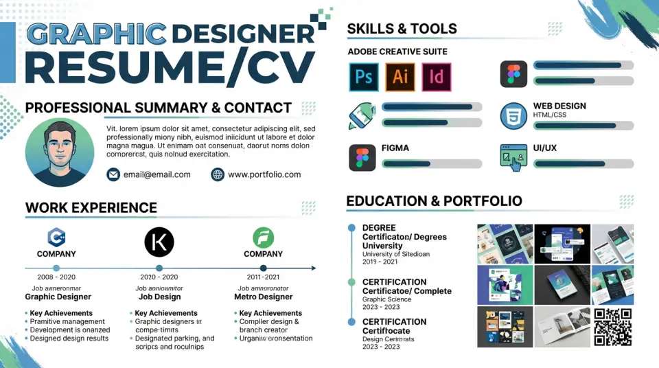
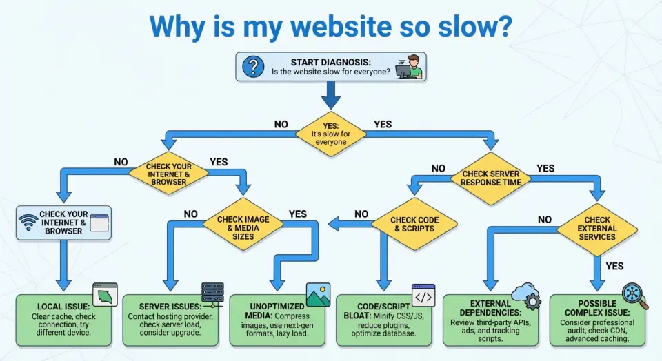
Common Infographic Types and Use Cases


Steps to Design an Infographic
- 1. Define the goal and audience
Decide the single message you want viewers to remember and who they are (age, knowledge level, where it will be seen). This keeps content focused and the visual choices relevant. - 2. Collect and simplify data
Gather reliable facts, stats, and quotes. Trim to essentials: pick only the data that supports your main message; convert complex numbers into simple comparisons or percentages. - 3. Create a clear structure (outline)
Sketch a short narrative: hook → context → evidence → takeaway. Use this as the backbone for flow and sequencing so readers can scan top-to-bottom or left-to-right. - 4. Choose a layout and template
Pick a layout that matches your story: timeline, process, comparison, or data-driven. Start from a template to save time and ensure balanced spacing. - 5. Establish visual hierarchy
Use size, color, and contrast to show importance: headline largest, key stats bold and colorful, supporting text small and muted. Limit fonts to 2 and colors to 3–4 for clarity. - 6. Translate data into visuals
Replace long text with charts, icons, and simple illustrations. Use bar/line charts for trends, pie or donut for parts, and icons for concepts. Label clearly and avoid decorative charts that obscure meaning. - 7. Design for readability
Keep margins, white space, and alignment consistent. Use short phrases, bullets, and one idea per visual. Ensure contrast for accessibility and legible font sizes for the intended display (web vs print). - 8. Add branding and sources
Include a small logo, consistent color accents, and a short source line for data credibility. Keep branding subtle so it doesn’t compete with the message. - 9. Review and test
Check for factual accuracy, visual balance, and flow. Show to 2–3 people from your target audience and ask: “What’s the main takeaway?” Revise until answers match your goal. - 10. Export and optimize
Export in the right format (PNG/JPEG for web, PDF for print, SVG for scalable graphics). Compress for fast loading and create alternate sizes for social platforms.
Recommended Infographic Design Tools
- DIY Tools: Platforms like Canva, Piktochart, Venngage, Infogram, and Adobe Express offer templates and drag-and-drop interfaces, making infographic creation accessible to everyone.
- Graphic Design Software: For more control, use tools like Adobe Illustrator or Affinity Designer (requires design skills).
- AI Help: ChatGPT, Meta, Claude, Grok, Google Gemini, Adobe Firefly, and Visme for idea & outline, data summary, auto visuals, smart layout, and instant charts.
When to Use an Infographic
Infographics are perfect for:
- Blog posts (increase time on page)
- Social media content
- Marketing campaigns
- Education & training materials
- Annual reports
- Presentations
- Data storytelling
If information is important and needs to be memorable, an infographic is your best friend.
Common Infographic Mistakes to Avoid
Even experienced designers fall into these traps. Watch out for misleading visualizations where the graphics don’t accurately represent the data, overcrowded layouts that overwhelm rather than inform, and generic stock images that add no real value. Be wary of trendy design elements that sacrifice clarity for style, and always fact-check your information—credibility is everything.
The Future of Infographics
The future of infographics is an evolution from static images into dynamic, integrated experiences. Key shifts include:
- Interactivity & Personalization: Users will click, filter, and input their own data to explore personalized insights, moving from a one-way broadcast to a two-way conversation.
- AI Co-Creation: AI will automate data analysis, generate visual concepts, and create multiple design variations, making production faster and more accessible.
- Immersive Formats: Augmented Reality (AR) will overlay data onto the physical world, while Virtual Reality (VR) will allow users to “walk through” data in 3D environments.
- Atomized & Integrated: Large reports will be broken into “micro-infographics” for social media, while interactive widgets will be seamlessly embedded in articles and apps.
Related Posts
Indie Games in 2026: How Small Teams Are Shaping Big Ideas
The landscape of Indie Games in 2026 is being shaped by passionate creators and small studios.…
The 2026 Online Income Tutorial: Low-Effort, High-Return Strategies
The top 2026 online income tutorial combines AI, niche skills, and automation for low-effort,…
Top AI Video Generators of 2025
Top 2025 AI video tools create cinematic films, polished corporate avatars, and rapid social clips,…

Welcome to Gemini Nano Banana Mania
Are you new to Gemini Nano Banana Mania? — read on for a hands-on look at Google’s latest nano AI…

Get One Year of Perplexity Pro Free with PayPal
Unlock a full year of Perplexity Pro at no cost with PayPal. This limited-time deal runs from…

AI vs. Nature’s Fury: Revolutionizing Natural Disaster Management
AI is revolutionizing how we handle natural disasters—enhancing early warnings, streamlining…

Top Directory Websites for Useful Business Listings in 2025
Leading website directories in 2025 streamline the search for services, tools, and job…

AI Tools Directory of the Month: AIvolut
Unlock new efficiency and insight with AI tools—intelligent engines reshaping work and life. Beyond…

AI’s Game-Changing Impact on Gaming
AI powers modern gaming with smarter enemies, adaptive teammates, dynamic stories, and immersive…

Top VPNs for Privacy and Security in 2025
Looking for the best VPNs in 2025? Discover the top 5 VPN services that offer speed, security, and…